没有哪一届的奥运,比2020东京奥运会更“命运多舛”的了……被迫延期、各种规划不当、重新设计、委员长演员辞职、国内民众抵抗情绪强烈……
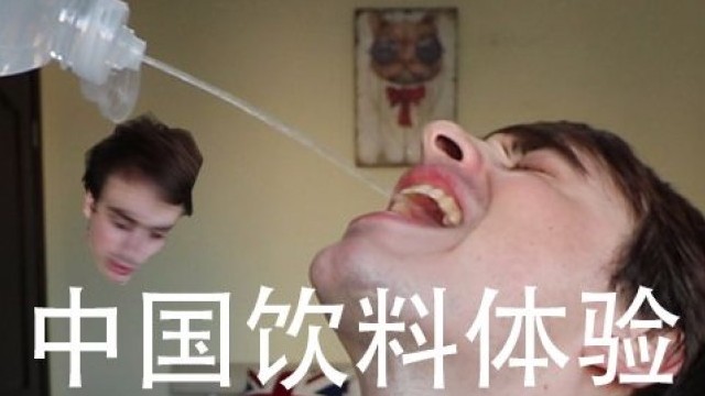
这一回又被吐槽上热搜的,是新鲜出炉的颁奖礼服设计。
不怪咱们看了吐槽这浓浓的“足浴店”既视感,日本网友更是表示:“难看到完全无法理解”、“没品位到让人吃不下饭”……
想起了彭彭的电影《沐浴之王》,总感觉志愿者们下一句就会问道:先生,手牌号多少?
或者在颁奖当天也可以应景地来一句:服务员,上奖牌!
是我们的审美落伍了?!还是奥运会的时尚品味过分与时俱进了??
The costumes used at the victory ceremonies were based on a concept of modern ceremonial dress and incorporate traditional kimono production techniques including "kasane” (layering), "ori” (weaving), "musubi” (knots), and "so-me” (dyeing).
这套颁奖礼服基于现代礼服的概念,并结合了传统和服工艺如 "kasane"(重叠)、"ori"(编织)、"musubi"(系带)和 "some"(染色)。
Designed with cooling technology so the wearer can withstand the heat and humidity of a Tokyo summer, the costumes, to be worn by volunteers who will carry the medals and escort athletes at the ceremonies, were made from environmentally-friendly recycled fibres.
设计采用了冷感科技,如此穿戴者得以抵御东京夏天的炎热和潮湿,志愿者端着奖牌,陪同运动员站在颁奖仪式上所穿着的这套礼服,采用的是环保可回收的纺织面料。
设计师表示:我衷心希望所有参与颁奖仪式的运动员们能释放热情,穿着礼服的志愿者们能为自己感到由衷的自豪。
老铁,你觉得他们能骄傲起来吗?这完全是妥妥的公开处刑啊!!!
事实上,这个颁奖服也是历经了“一改再改”的过程。此前曝光的第一稿志愿者服饰是这样的:
后来因为太韩式被毙了,接着又出了第二稿,走起格子风路线,呈现的是蓝白格相间的设计。emmmm......感觉就是行走的马赛克!
这时候不得不深挖一下这位“奥运礼服”背后的功臣——日本新锐设计师、造型师、小众潮牌 Mikirihassin品牌总监山口壮大:
作为“传统的变革者”,他参与了多个时装秀、店铺、活动的设计。
这次的“新式礼服”就是他“现代与传统”灵感碰撞的结合,即使被人吐槽“廉价感十足”的海滩凉拖,也是他考虑再三摒弃木屐,选择更现代、更方便的方案的结果。
The trays on which the famous gold, silver and bronze Tokyo 2020 medals will sit, was produced using recyclable thermoplastic polymer and bear a traditional Japanese fan motif. The base, coloured indigo blue - the deepest of the Tokyo 2020 core graphic colours - harmonises with the podiums and costumes.
2020东京奥运会的金银铜奖牌,也是采用了回收利用的热塑性聚合物制成,放置在传统日本扇形图案上。底部托盘为靛蓝染色——它也是2020东京奥运会会徽的标志性颜色,与颁奖台和礼服相映成趣。
Up-and-coming Japanese fashion director YAMAGUCHI Sota, who designed both the costumes and medal tray, said: "Blending the emotional aspect of Japanese clothing with the practical design of Western clothing has allowed me to create comfortable and lightweight formal wear. In a nod to forward-facing Japanese craftsmanship, I engaged craftspeople and factories across Japan, using eco-friendly materials to produce only the quantity needed in the most efficient manner possible."
山口壮大,这位负责礼服和奖牌设计、日渐崭露头角的日本时尚总监表示:“将日本传统服饰的情怀与西方实用至上理念的服饰做结合,让我得以设计出了舒适、轻便的这套正装。也为了致敬不断发展的日本工艺,我寻遍日本的手工艺人还有工厂,采用环保材料,用最有效的方式打造如此大量的成品。”
设计师的理念是一回事,但大众接不接受又是另一回事了……毕竟logo,当年也是遭万人吐槽,丑不说,更是深陷抄袭丑闻……
很快网友发现它长得很像2013年比利时剧院的logo……
更尴尬的是该logo的原设计者Oliver Debie都发推还做了动图,就差把“你们抄袭”白字黑字的控诉写出来了……
于是这个方案就被封杀了,现在用的新logo定下了这一版:
但这届奥运就拿不出一样出彩的设计了吗?倒也不是,至少先前发布的“运动图标”就惊艳了众人:
The tokyo organising committee of the olympic and paralympic games has revealed over 70 new pictograms depicting every sport in tokyo 2020. The pictograms are designed to subtly communicate the characteristics and athleticism of each sport.
为2020东京奥运会,东京奥运会组委会发布了70个全新奥运会和残奥会运动图标。这组图标很好的将每一项运动的运动精神和人物表现结合了起来。
The pictograms were animated by japanese motion designer kota iguchiare and cover 33 olympic sports and 22 paralympic sports, using the blue of the tokyo 2020 emblems.
让这组图标动起来,都归功于日本动画设计师井口皓太,其中囊括了33项奥运会项目和22项残奥会项目,并采用2020东京奥运会的象征色蓝色。
Olympic games sport pictograms were first introduced at the tokyo 1964 games, which arose from a need to communicate visually to an increasingly international group of athletes and spectators.
奥运会运动图标第一次出现是在1964年的东京奥运会上,为的是从视觉上增进不同国家运动员和观众的互动。